WORKING GROUP 1 REPORT
Meeting at Northern College, Sep. 29 - Oct. 1, 2000
NOTES ON JEWELS SITE LAYOUT
Anders Eriksson, Mike Rosner, Mark Tatham
Througout this document:
-
Items in italic concern both section editors and VDI-VDE
-
Items in normal font concern VDI-VDE only.
-
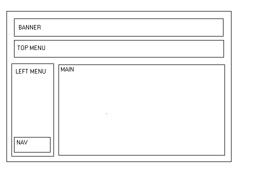
The following terminology is used to refer to "panels" of the JEWELS window,
which should adhere to the following standard:
A. Consistency of appearance
-
Screen Resolution:
-
Assume 800x600 screen resolution throughout
-
Banner Panel
-
Rotating logo - improve the resolution and identification of each individual.
The rotation should be smoothed and any jaggies on low resolution screens
should be interpolated.
-
Top Menu
-
Top menu - change gifs back to text with the appropriate colour change
on rollover (cf. the original sample site).
-
Attention should be paid to the content of the top menu bar - consult
with other groups as to appropriate names here. The ordering and grouping
of items is also important - differentiate between content and tools.
-
Main Panel
-
Title header - white text on gray background should be:
-
fully right-justified (consistently across site).
-
all lower case
-
eliminate abbreviations wherever possible
-
use of '&'; should always have spaces round it
-
If possible avoid use of "Welcome to the ...", e.g. "Welcome to the
course and sites databases". Prefer "course and sites database".
-
Paragraph style must be consistent.
-
No indent at beginning of paragraph
-
Single linefeed between paragraphs.
-
Indented paragraphs (like bulleted lists or quoted material) must be
consistent.
-
Long pages. We recommend breaking information text into screen-sized
chunks (20 lines). The chunk size should also be appropriate for printing.
As closely as possible the printed page should match the screen page and
be conceived as 'one chunk of information per screen and per page'.
-
Main page should be implemented as a frame so that if long, it can be scrolled
independently.
-
Left Menu Panel
-
Button labelling must be consistent in terms of style and positioning.
The navigation buttons should not appear mixed with content buttons: recommend
placing navigation buttons in a small separate frame at the bottom of the
left menu panel (see notes on Navigation Panel below).
-
Button names must be kept short - some are currently too long. Use abbrevations
here if necessary (but must be consistent) - use mouseover popup labels
in these cases. Be careful to ensure that popup labels can spill across
frame boundaries (if possible).
-
Content providers should supply appropriate abbreviations for long button
names.
-
Define consistent colour change for buttons onmouseover (these should perhaps
be different from the top level menu). Button text should change colour
when its own text is displayed in the main panel.
-
Navigation Panel
-
Navigation Panel should always be visible in position
-
Navigation buttons should generate a popup site map. This popup should
have different ways of closing: top-right windows button, button at the
end of the text, mouseclick on the original window.
-
Minimally, popup site map should indicate hierarchical structure of entire
site together with an indication of "you are here"
B. Forms
-
Appearance
Forms are used to gather input data (a) for queries, (b) for registration
of sites, courses, materials, for logging in etc. All forms should have
a consistent appearance concerning the position and style of
-
Title: centered; font size +1; boldface.
-
Submit button: bottom left. Always present.
-
Reset button: bottom right. Always present.
-
Other buttons (optional): bottom, centred
-
Field Names: normal font; not numbered.
-
Functionality
-
Form always appears in a separate form-window.
-
On submit, style of result presentation depends on kind of result obtained.
-
In case of simple confirmation (e.g. after a successful login), result
appears in same form-window with the message "OK" and a button marked "close"
which closes the window, returning control to the main window. In case
of error, form comes back in same form-window (with error fields highlighted)
so that original data can be reused.
-
In case of registration/edit form (e.g. details of sites, courses, or materials),
then submit causes details to be displayed, in main window, as they would
be displayed after a subsequent query. Note that at this point the original
form is still available in the form window in case the user wants to make
further changes.
-
In case of a search form, hit-list is displayed in main window. Hit-list
links, when clicked, are always displayed in a third window so that hit-list
remains accessible.
C. Future Updates: Version Numbers
Currently, there is a tendency for the system to evolve in an uncontrolled
way so that comments or suggestions for changes made about the system at
a given moment are difficult to verify or evaluate at a slightly later
moment.
We suggest a simple form of version control which distinguishes between
-
Updated content that is directly entered and modified by editors/content-providers,
and
-
Updated system software that is released by implementers.
We need to make this distinction because changes of the first kind are
"continuous", take place directly whenever an editor makes a change, and
are thus too frequent to merit version control beyond merely backing up
the entire website periodically.
Changes of the latter kind, however, need to be more systematically
organized. We propose that periodically, the system software is frozen
and associated with a version number to which any comments or suggestions
are then directed. The implementers will then be free to develop the next
version, incorporating the comments made about the preceding version. At
release of the next version, it then becomes easier to judge what has actually
been achieved.
Responsible Author Mike Rosner
Last Updated: 3.10.2000